Accessibility Game
Case Study
The Problem
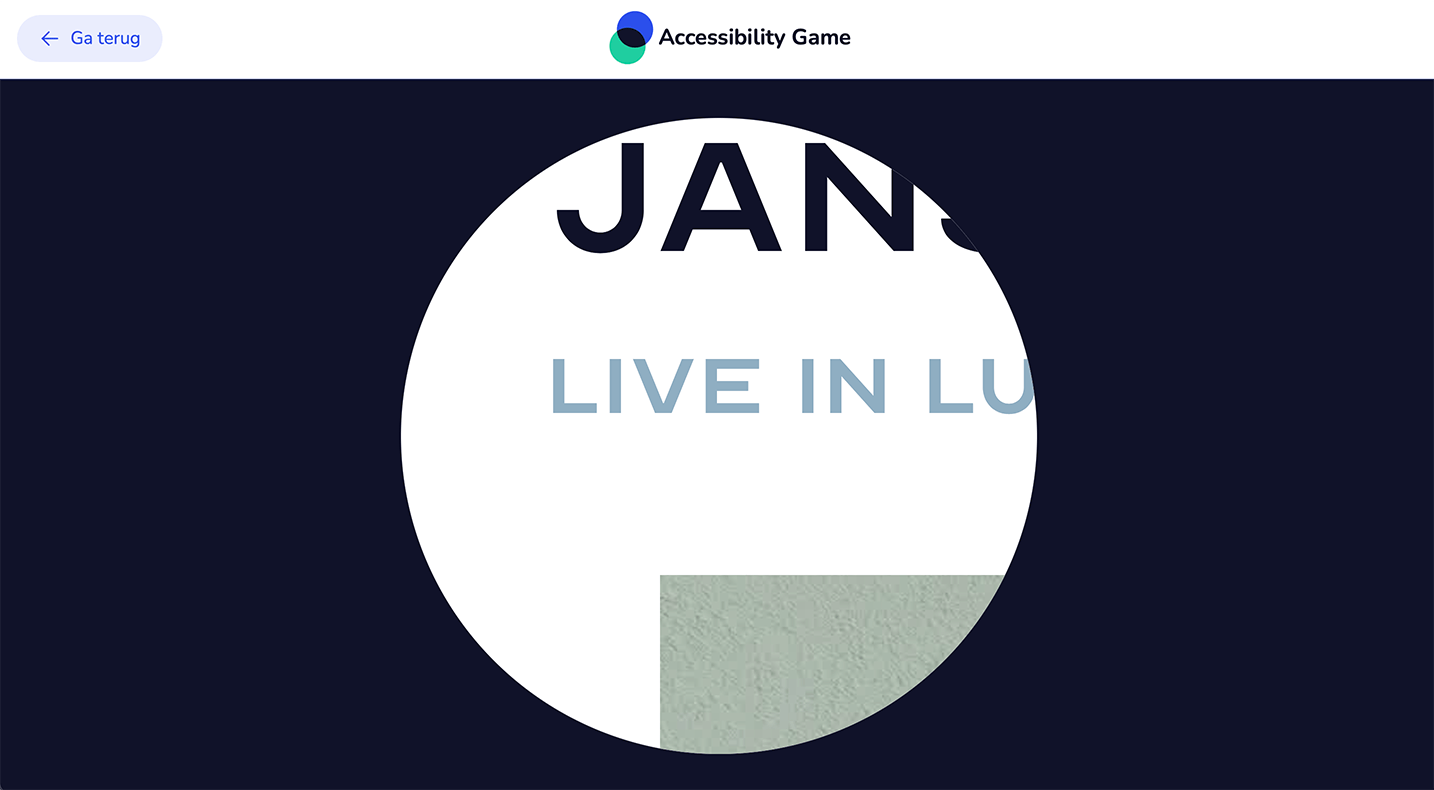
There is a large of group of disabled people that can't use their devices like the rest of us: visually-impaired people can't see the screen so they have to rely on screenreaders, deaf people are lost when a video doesn't have subtitles and even reading the text on a page can be difficult for people with dislexia or ADHD. Things that are quick and easy for most can become massive hurdles for people with disabilities.
Our Solution
There are ways designers and developers can accomodate for people with disabilities but a lot of designers or developers don't know about accessibility or see the benefit of it.
With the Accessibility Game, Stichting Accessibility and I set out to raise awareness, spread knowledge and inform people about the field of accessibility, how important it is and how they can make a difference.


Client & Users
Stichting Accessibility is an organisation with a mission to make the internet a more accessible place; They conduct accessibility audits, give workshops and initiate projects to increase awareness and knowledge about the subject.
The game will eventually be used during accessibility workshops and will be spread online through social media.

Design Process
The design process consisted of constant prototyping and iterating, at every step of the way I consulted and tested with experience experts to get a grasp on how they experience the web and how I could emulate their struggles as accurately as possible.
Early versions of the game were sent out to experience experts and players along with questionnaires to get feedback on as many parts of the design as possible.

Design Decisions
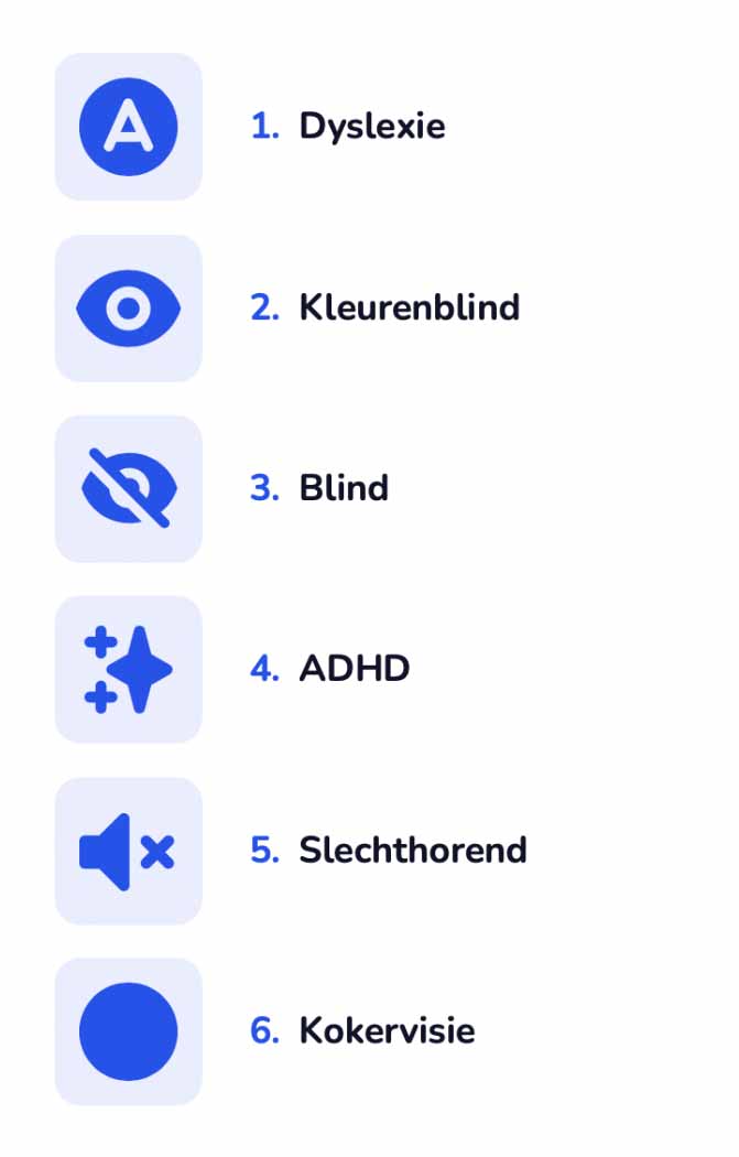
Designing the game was a balance between realism and fun, I wanted to accurately depict the struggles of disabled people on the web but at the same time have it play like a game. We decided to implement 6 different disabilities, ranging from color-blindness to full blindness to ADHD.
In order to encourage replayability of levels, each level gives the player a score based on how they did and how fast they completed the level. After this the player is taken to a screen that explains more about the disability, what the consequenses are for people that have it and what designers and/or developers can do to improve the situation.
To make the game feel more like a game I made a bunch of playfull illustrations and added a wealth of sound-effects, especially to the ADHD level, which was designed to be as distracting as possible.
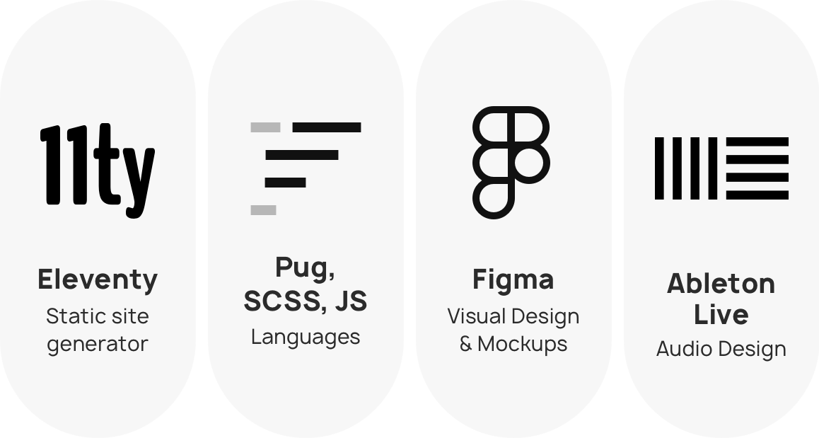
I made the visuals in Figma, loosly based on the visual brand of Stichting Accessibility and made the sound-effects using Ableton Live with a combination of public domain and synthesized sounds.
Tools used
